Project Type
University Coursework, SECOND YEAR
Module
Mobile Application Development
The brief
To create an interactive data visualisation. The artefact should present some basic data that is immediately understandable, in an engaging and aesthetically pleasing way (ie like a poster), to the user, and then allow them to drill down (by interacting with the artefact) to find out more specific info.
The artefact needs to pull (not be hard coded into the content) information from a data source (file or database).
Skills Acquired
Analyse, synthesise, and combine data sets.
Apply standard technologies to develop a data visualisation for delivery via the web.
Employ user experience methods and techniques to a data visualisation.
Demonstrate universal design rules in an artefact.
Process
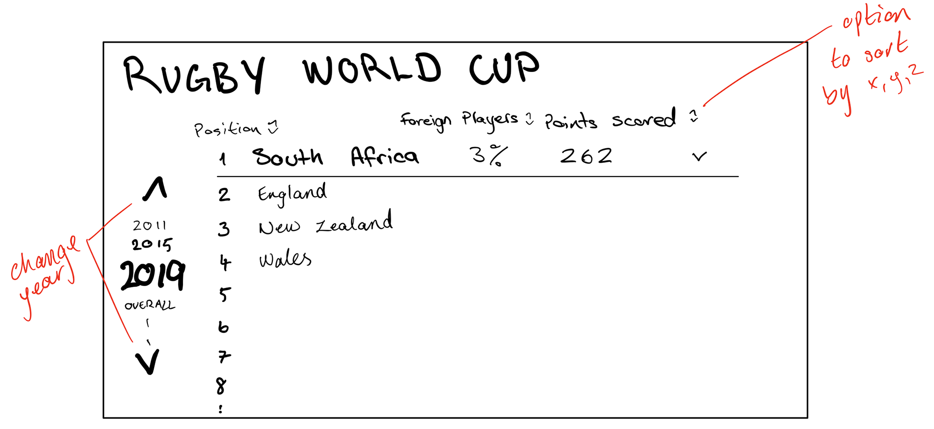
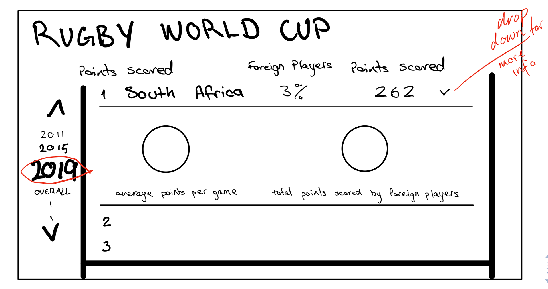
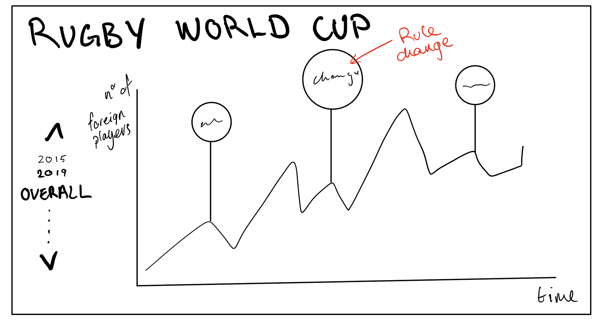
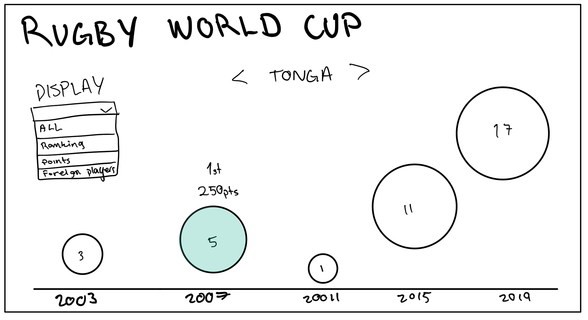
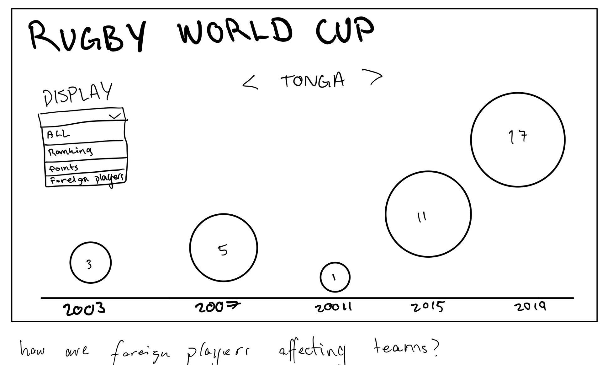
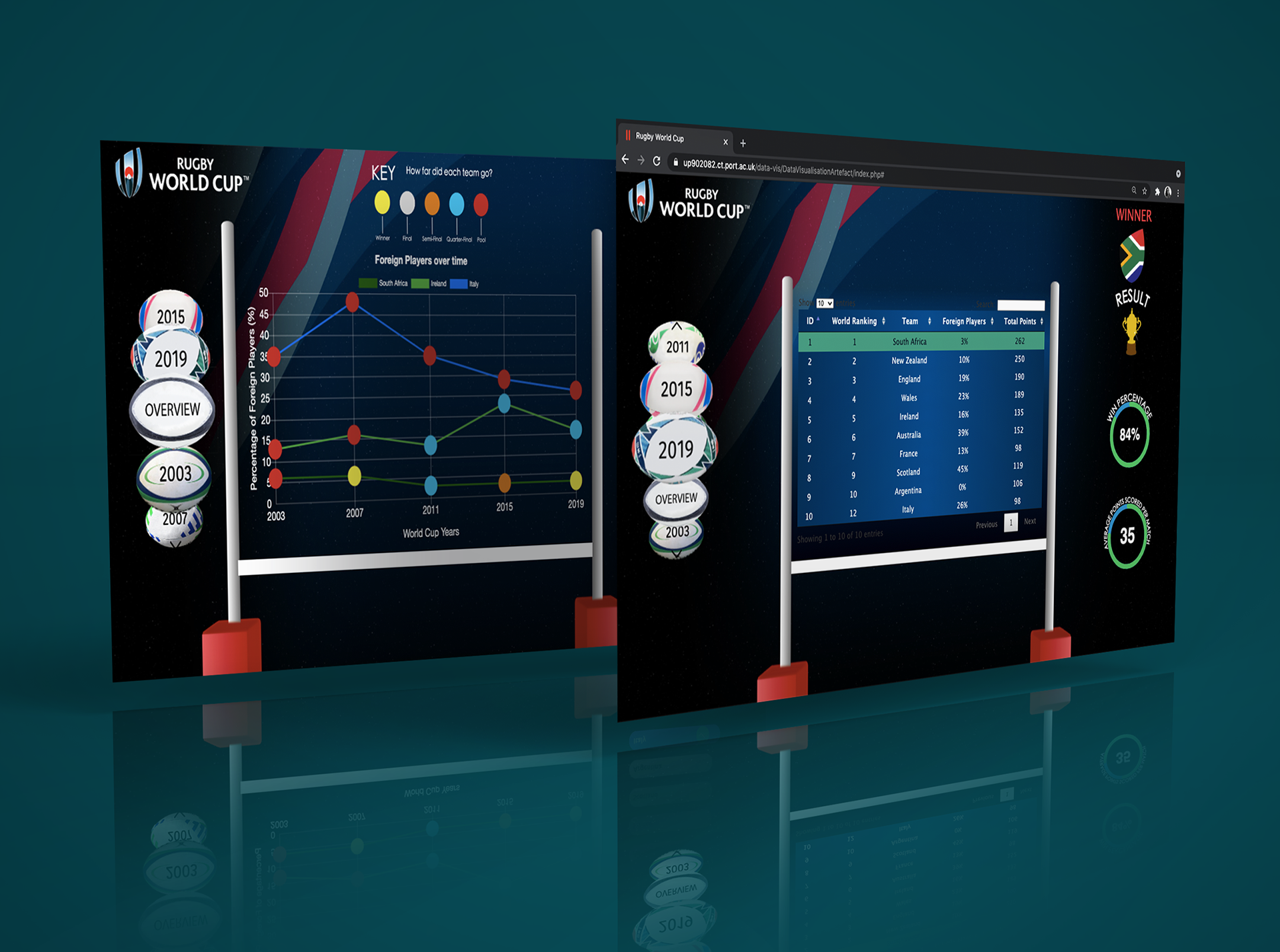
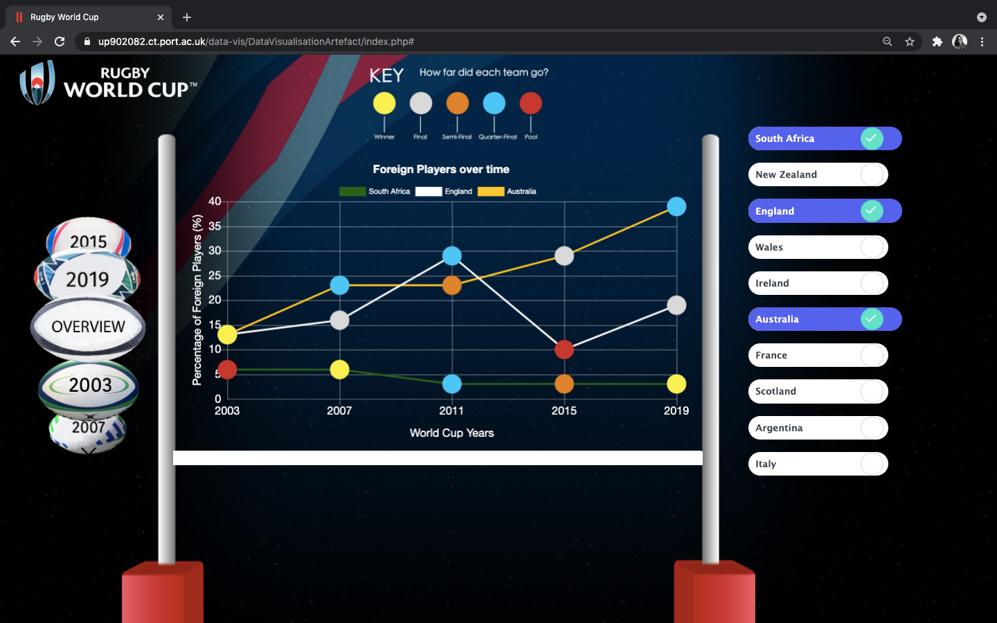
Initially the theme for this artefact was going to be endangered animals and their extinction rate but all the data was estimated and sparse. When I started to look for other topics to use, the Rugby World Cup was on (go Scotland!). While watching the match and team statistics, I saw that for National teams, there were surprising amounts of international players. This got me thinking: does this affect how the team plays?
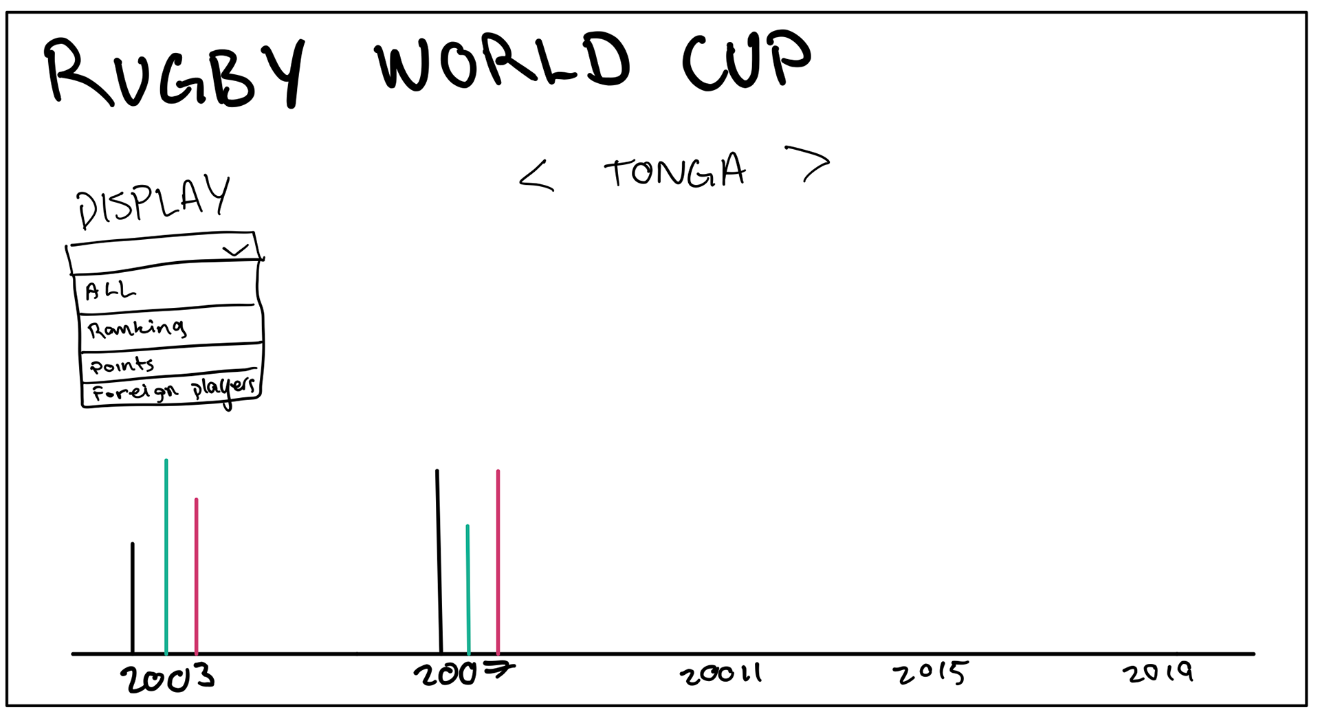
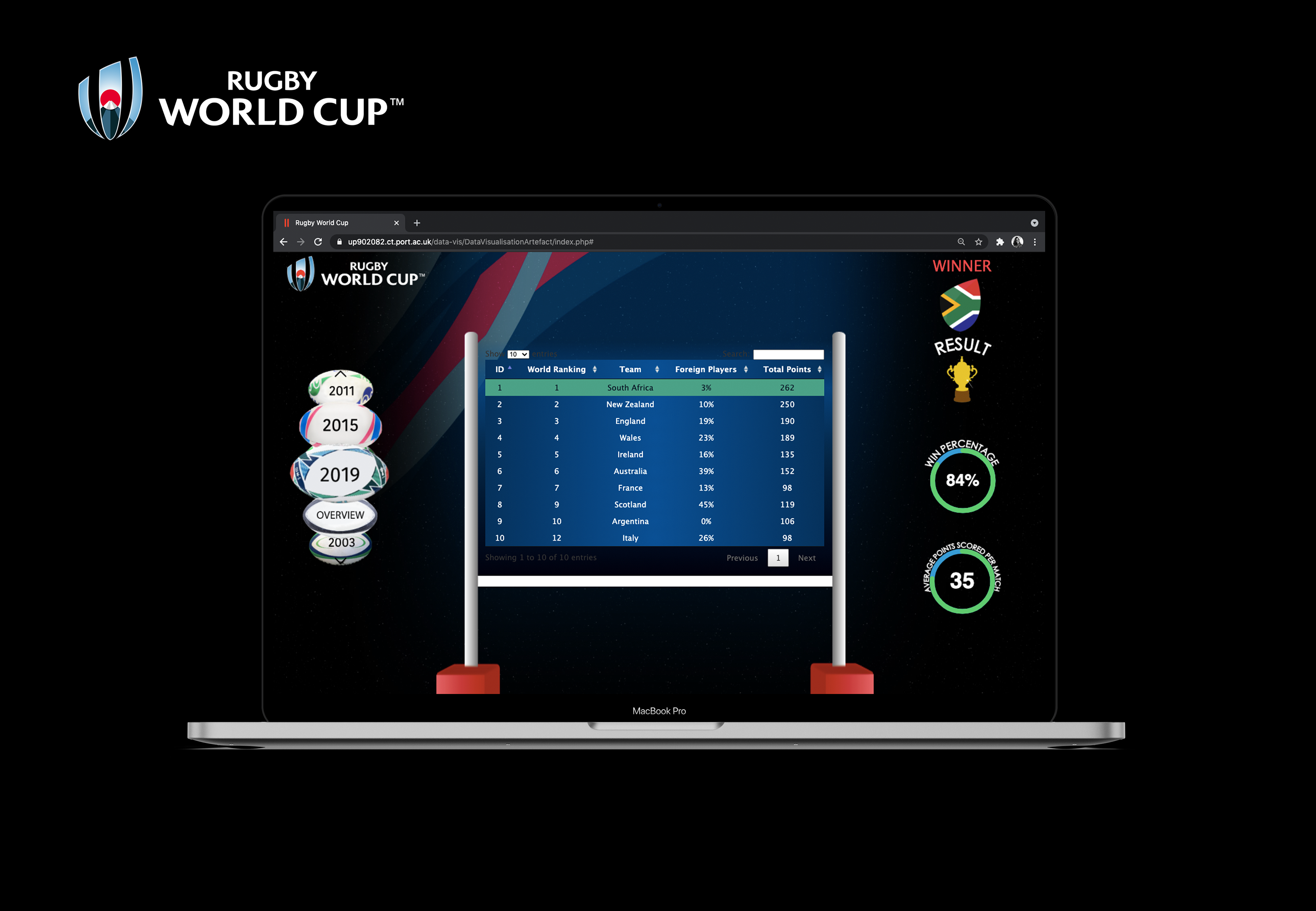
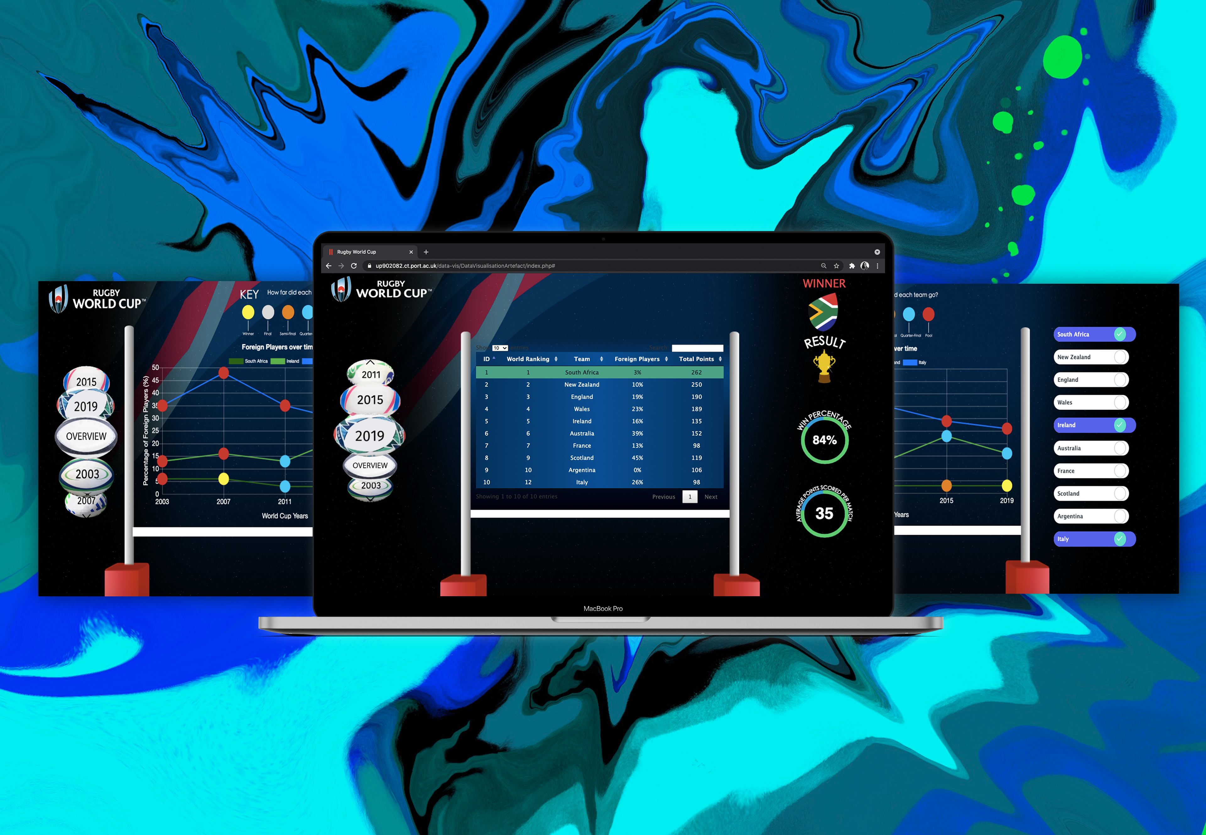
There were many different technologies and libraries that I could use to create the artefact. I used jQuery, JavaScript, and PHP for the functionality of the artefact as PHP allowed me to dynamically update the tables in the database and have it update into the table / line chart on the page.
This site does not use Bootstrap because I could not implement a vertical scroller that worked for me using it with the desired effect to display the yearly rugby balls on the left of the screen.
Instead I found a small basic jQuery plugin called Skywheel which provided a base for me to work with. I did go in and change the JavaScript file that it came with to make it work for me.
If I had more time I would make it responsive and viewable across all devices using Bootstrap. I would also add in more interactive elements as well as make the existing elements have some more interesting animations. The table I used is effective and gets the information across clearly, however I could find an alternative approach to displaying that data.

The prototype for this artefact needed to be with PowerPoint. Why? Good question! I don't know, as I would normally use Figma or Adobe XD as they are a lot more streamline and aesthetically pleasing. I learned that you can make prototypes with it, it just takes a lot longer to do! You can see this prototype along with my full explanation of my calculations, data sets and method by clicking this button.